
This is a look at the McDonald’s Logo and the incredible history behind the business.
The golden arches of the world’s largest fast-food empire are, without a doubt, one of the most recognizable logos in existence. With over 35,000 restaurants in 120 different countries and a net worth of $39.1 billion, McDonald’s is the ninth wealthiest company in the world and the largest of any fast-food chain. With success like this, the history of McDonald’s and its famous logo is an interesting case study to look at.
![]()
The Evolution of the McDonalds Logo. The Mcdonald’s logo has changed several times over the years. The first logo design was in 1940. When the ’60s came around McDonald’s wanted to simplify their logo and work on branding the business. Choosing the golden arches as the logo was brilliant and a key move to brand the fast-food restaurant.![]()
The History of McDonald’s
What is now a worldwide fast food empire started as just a single food stand in Monrovia, California. In 1937, the patriarch of the McDonald family, Patrick McDonald, opened a food stand he called the “Air Dome” near the Monrovia Airport. The Air Dome started out selling hot dogs, but would later add hamburgers and orange juice to the menu as well.
In 1940, Patrick’s sons, Maurice and Richard McDonald moved the food stand to San Bernardino, California, and renamed it “McDonald’s Bar-B-Que”. As the name would suggest, the menu of the restaurant changed as well, with 25 mostly barbecue items being sold.
Eight years later, the McDonald brothers came to the realization that the majority of their profits were coming from the sale of their hamburgers. It was also at this time that they began to focus on streamlining their service process to maximize efficiency and profitability. The McDonald’s menu was reduced to just a few items, including hamburgers, cheeseburgers, fries, milkshakes, and apple pie. Carhops were eliminated and replaced with a self-service system, and the brothers took painstaking efforts to ensure that their kitchen was assembled in the most efficient manner possible. In 1952, the name of the restaurant was shortened, changing for the final time from “McDonald’s Bar-B-Que” to “McDonald’s”.
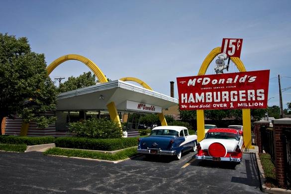
Having settled on the name we are all now familiar with, the McDonald brothers began in 1953 to transform their business model into the one we are now familiar with as well. They sought out their first franchisee, a man named Neil Fox, and thus expanded their chain to a second location. It was at this location that the golden arches were introduced. Using a rendering from an architect named Stanley Clark Meston, the McDonald brothers built their second restaurant to be both eye-catching, efficient, and a place that would encourage visitors to eat quickly and leave, thus maximizing the number of people they could serve.
Though the chain introduced many new processes, designs, and advertising methods over the years as they continued to build more and more restaurants, many of the elements seen in Meston’s first design are still seen today, including the ultra-recognizable golden arches logo.
The History of the McDonald’s Logo
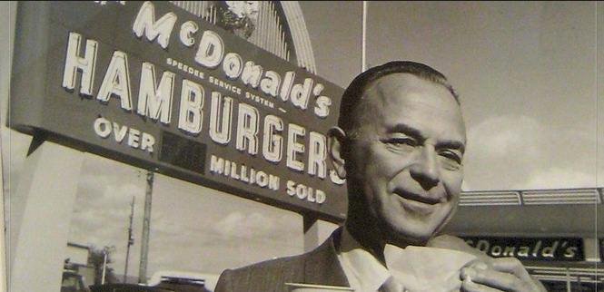
Though the golden arches were present in the architecture of every new McDonald’s restaurant starting in 1953, it wasn’t until 1961 that the unique architecture was incorporated into the company’s logo. It was that year that the business was bought by Ray Kroc, who then asked McDonald’s president Fred Turner to come up with a new logo for the business. At first, Turner attempted to design the logo himself but eventually turned the task over to head of constructions and engineering Jim Schindler. It was Schindler who sketched out the first logo to incorporate the golden arches, though his design also featured a slanted line running through the “M”.
Between 1961 and 2003, the McDonald’s logo would undergo several more iterations. In 2003, though, the company settled on a design and slogan that would continue to this day. The company’s iconic golden arches became the only element present in the design, save for a line of text beneath them that read “I’m lovin’ it”, purposefully written in all lower case. Whether the logo will change again in the coming years is something yet to be seen, however, one thing is for sure: the current McDonald’s logo has had a lot of staying power over the past 14 years. It is now one of the most recognizable symbols in the entire world.
Design Elements of the McDonald’s Logo
![]() One of the most effective design elements of the McDonald’s logo is the fact that it looks similar to two of the restaurant’s golden brown French fries bent into the shape of an “M”. It’s a subtle message that advertises one of McDonald’s most popular menu items without the viewer even realizing it.
One of the most effective design elements of the McDonald’s logo is the fact that it looks similar to two of the restaurant’s golden brown French fries bent into the shape of an “M”. It’s a subtle message that advertises one of McDonald’s most popular menu items without the viewer even realizing it.
Another critical design element of the McDonald’s logo is its simplicity. At the point in time, the current logo was unveiled, McDonald’s was already an extraordinary recognized and successful chain. The company didn’t need a logo that would help explain what they offered—people already knew. Instead, they needed a logo that would be simple, unmistakable, and easy to recognize from a distance. The 2003 version of the McDonald’s logo was the perfect fit.
Lastly, the company chose to incorporate their slogan “I’m lovin’ it” into their logo. In this slogan, the company purposefully uses lower case letters and abbreviations to convey a carefree and informal tone.
The popularity of the McDonald’s Logo

Like it or not, the McDonald’s logo has become one of the symbols of American culture across the world, and not necessarily for good reasons. In recent years, McDonald’s has come under fire for promoting poor health choices and waste. It’s an image the company is trying to combat, but one that their iconic logo has come to represent nonetheless. For many of the same reasons that McDonald’s has come under fire across the world, the US has faced criticism as well, and the McDonald’s logo is seen by many as a symbol for some of the less-appealing aspects of American culture.
These negative connotations aside, the McDonald’s logo is still an incredibly popular icon in pop culture. Its appearance in television, movies, comics, and art are almost countless. It’s been a lot of free advertising for the franchise and demonstrates the power behind a simple, immediately-recognizable logo.
Today, the golden arches can still be found all across the world, and whatever lousy press the chain has received has little to hurt its business. Like their logo, McDonald’s doesn’t look like it is going anywhere, and you can count on seeing the golden arches on street corners and in pop culture for many years to come.
McDonald’s FAQ
| Who designed the McDonald’s logo? |
| The Mcdonald’s logo was designed by Jim Schindler in 1962. He was hired to give the logo a more corporate look. He sketched out 2 arches, combined them, and created one of the most recognizable brands in the world. |
| Why is the McDonald’s logo effective? |
| The golden arches are bold, powerful, and can’t be missed when passing by a McDonald’s. The big yellow arches give you a sense that McDonald’s stands above its competition and can be trusted as a fast-food giant. |
| What is the McDonald’s logo called? |
| The Mcdonald’s logo is widely known as “The Golden Arches”. An early campaign for McDonald’s told customers to “look for the golden arches”. |
| What is McDonald’s slogan? |
| The slogan for McDonald’s is “I’m Lovin It”. It’s one of the most popular recognizable slogans in the world. A Rapper named Pusha T came up with the slogan. |


