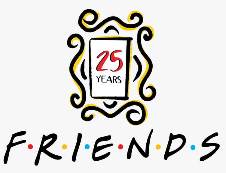
This is a look at the Friends Logo and some history of the television show.
What are friends for? Don’t act so fast to answer. Think carefully! This is because the question has a subtle twist to it. I know most of you’ll be thinking of the value of friendship. That’s less of what I’m asking of you. “Friends” is the drama that hit the television screens in the earlier 1990s.
It started slowly but soon won many hearts and eventually joined the most-watched television dramas of all time. The film tells the struggles of six naïve youngsters in their earliest twenties. It captures their jobs, love affairs, divorce, fights, heartbreaks, etc.
There’s a link between “Friend” and “All My Children.” Can you recall it? Well, let me help you out. The six characters in “Friends” took their names from “All My Children.” Let’s look at two of them: Chandler from the Chandler family and Rachel Green from Janet Green.
There you have it—inspiration from another drama. The celebrated comedy series has a namesake logo, FRIENDS. This wordmark trademark comes with colorful dots between the letters. These dots, as simple as they look, have made fans to read meaning into them.
The mark led a drama series that lasted for ten years. With 236 episodes, starting from September 1994 and ending in May 2004, the wordmark reached and entertained about 52 million viewers on its final airing. The logo and its casting characters became household names.
After close to thirty years, the drama and its iconic logo are becoming popular again. They are the favorite among the same age bracket who were kids when the series premiered. Aside from the internet mediums, you’ll find these young adults wearing clothes with the logo.
The Evolution of the Friends Logo
The Friends logo has had only a single update. But the change didn’t affect the look of the design. For a unique and attractive logo, it’s good that it has undergone a minor redesign. You can read the few changes below:
1994 to 2004—The Original Friends Logo
 For the ten years that the drama series lasted, a fancy wordmark logotype led it to popularity. It has a custom typeface with six colorful dots between the black letters. These dots represent the principal characters—Rachael, Monica, Phoebe, Joey, Chandler, and Ross.
2019—The Friends Anniversary Logo
 The only updates took effect in 2019 to celebrate its 25th anniversary. The designer changed the positions of the colorful dots. Also, the letters became cleaner and more prominent than the previous one. The refined typeface has a rectangle frame above it. The designer further enclosed the rectangle frame inside four curved lines with vignettes at their ends.
Why does the Friends Logo work?
The iconic logo works because it’s useful. Thus, it has met the rules of logo design. This means the logo is unique, simple, versatile, timeless, and memorable. Let’s look at each of them a little further:
- Uniqueness:
The Friends logo is distinct from other brands in the film industry. There is no identical logotype like it. That means it’s easy for fans to spot it from the crowd. With this rarity, fans can’t mistake it for another emblem. That’s a powerful marketing tool for staying above rivals.
- Simplicity:
The modest design of the Friends logo makes it an effective trademark. The design is clean, with no elaborate graphic elements that would confuse fans of its personality. Fans can notice it from afar and describe it with little thinking.
- Versatile:
With its fewer design elements, the Friends logotype is versatile. It can fit any marketing medium without losing its quality. Whether large screens or smaller ones, the layout is flexible enough to scale through with excellence.
- Timeless:
Unique logos can keep their popularity over the decades. Yet, few are the ones that can brag about this achievement. You can place the Friends signature design among such timeless designs. For about three decades, the famed wordmark is gaining more popularity than ever.
- Memorable:
The sleekness and attractiveness of the design have created a lasting impression on the minds of fans. That means it’s relatively easy for them to recall every detail of the logo with clarity and accuracy. The six dots also contribute to the memorability of the wordmark.
The Friends Logo Design Elements
 The Friends trademark is simple. In the original Friends logo, you’ll find a typeface and colors. Yet, the designer used the colors in appealing and creative ways. In the updated design, you’ll come across a frame and some curved lines. These elements don’t intricate the wordmark.
The Friends Symbol and Shape
- A Square:
The anniversary friends logo comes with a rectangle frame. A rectangle, when used in branding, conveys the feeling of balance and stability. It also signifies strength, honesty, and professionalism. In their quest to learn how the real world functions, some members exhibited these vibes. In contrast, others aligned with some negative emotions.
- Curved Lines:
Again, the anniversary friends logotype has four curved lines. They protect the frame at the four ends. A curved line is a softer design element, and it expresses movements. Some positive emotions that it evokes are calmness, comfort, and safety.
The Friends Logo Colors
- Red:
The Friends logo has two red dots. You can also link the color with Rachael and Ross’s umbrellas in the opening scene. Red, the color of sunshine, stands for desire, passion, and love. It can also signify danger, anger, and aggression. These were some intense emotions that the series entertained fans with.
- Blue:
Joey and Chandler held umbrellas that resonate with the color of the sea. The logotype has two blue dots, which also stand for two of the characters. Blue signifies faith, loyalty, and confidence. It also represents stability, calmness, and peacefulness. The blue color reflects the cordial relationship between Joey and Chandler: It was a well-portrayed color in the drama.
- Yellow:
Yellow conveys happiness, clarity, and freshness. It also signifies energy and caution. Monica and Phoebe had yellow umbrellas at the beginning of the show. The designer of the logo also used two dots of yellow to represent the characters. This color represented the moods of Monica and Phoebe in the best ways. For instance, Monica is happy going while Phoebe looks fresh.
What font is the friends logo?
Friends fancy typeface, which looks handwritten, is a font called Gabriel Weiss’ Friends. It’s a clean font that’s bold, readable, and memorable. It’s also versatile and modern, though it’s closer to its third decade. You love the drama; why won’t you like the font?
Who made the friends logo?
That is the question on most peoples’ lips. And considering the simplicity of the logo design and its popularity, it’s a fair inquiry. Deborah Nayee owns the credit for designing the Friends iconic signature. The sleek design shows her adept skills, professionalism, and attention to detail.
Is the friends logo copyrighted?
For a logo to represent a successful drama series for about three decades, it’s safe to think it’s copyrighted. Otherwise, the US Copyright Office won’t permit its use. Warner Brothers owns the copyright to the Friends wordmark. So, anyone who intends to use the iconic artwork should discuss it with them to avoid any lawsuit.
Why does the Friends logo have dots?
The six colorful dots have sparked exciting debates among fans. Some think their positions make the word appear as an acronym. If so, what does it mean? Others feel it represents the six unforgettable characters. Still, few others strongly believe they stand for the umbrellas used in the opening scenes.
Well, the answer is simple. According to Kelvin S. Bright, executive producer of the show, the dots mean nothing in particular. They are just design elements used to make the wordmark look friendlier, fancy, and memorable. Well, I will say they make the logo glow with uniqueness.
Who created the Friends Drama Series?
David Crane and Marta Kauffman created the TV show, Friends. Let’s learn briefly about these partners who brought us the most popular television series of all time.
David Crane:
 David Crane, an American writer, and producer, was born on 13th August 1957. His parents, Gene Crane and Joan Crane lived in New Jersey when he was born. He finished Harriton High School in Pennsylvania and later graduated from Brandeis University in 1979.
David got married to Jeffrey Klarik, and they have two children—Clancy Klarik and Blaine Crane. Together they have created various films for the viewing pleasure of many people across the world. Some of these films are Half & Half, Mad About You, and Episodes.
Yet, people know him as one of the Friends creators, arguably the most popular television series in American history. He won several awards for his hard works in the industry.
Marta Kauffman:
Marta Kauffman was born in September 1956 in Philadelphia. She is an American television writer and producer. Marta attended Marple Newtown High School and later graduated from Brandeis University in 1978. She had a Bachelor of Arts in theatre.
Marta was a student director of “Our Town,” a school drama in 1974. She got married to Michael Skloff, the composer of the Friends theme song. Together, they have three children—Hannah, Sam, and Rose. They divorced in 2015 after 31 years of marriage.
Like David Crane, she is famous for the Friends drama series. Yet, she has created several films as a writer and producer. These include Dream On, Sunday Dinner, and Family Album. Few others are Couples, Veronica’s Closet, and Grace and Frankie.
Marta’s contributions to the literary works have not gone unnoticed. She has received several awards—Primetime Emmy Award, Cable Ace Award, Gold Derby Award, etc.
How Friends Got Started?
In November 1993, David Crane and Marta Kauffman started developing Friends. The maiden title was “Insomnia Café.” They presented the idea to Bright, a former working partner. And together, they pitched the drama series to NBC.
With over 100 titles, changes, and writes, the comedy series took on “Friends.”The series had Jennifer Aniston as Rachel Green and Courteney Cox as Monica Geller. Lisa Kudrow played the role of Phoebe Buffray, and Matt Le Blanc settled for Joey Tribbiani.
The others were Matthew Perry, who acted as Chandler Bing, and David Schwimmer, who played Ross Geller. Rachel worked as a server at Central Perk Coffee House. And Monica found a job as a chef at different restaurants.
The show also featured Phoebe as an aspiring musician and Joey as a struggling actor and a glutton. Finally, Ross worked as a paleontologist at a museum. With these six characters, filming started at Warner Brothers Studios in Burbank, California, in front of a live audience.
On Thursday at 8:30 pm, the show premiered on NBC in September 1994. “I Will Be There for You” became the opening theme song. The Rembrandts performed the song. The original producers were David Crane, Marta Kauffman, and Kelvin Bright.
How Big Was Friends Drama Show?
 Friends is an American television comedy-drama series staged in New York City. It premiered on 22nd September 1994 till 6th May 2004. It aired ten seasons over ten years on NBC.
The series featured Lisa Kudrow, Matt Leblanc, and Jennifer Aniston. The other three were Courteney Cox, Matthew Perry, and David Schwimmer. Before I forget, Bruce Willis starred in season six as Paul Stevens, Elizabeth’s father.
The famous sitcom show aired 236 episodes, totaling about 85 hours. Can you recall the number of viewership it got? Well, it had a staggering 22 million fans glued to their television sets on its first airing. And each cast member took home $22000 per episode for the maiden season.
Yet, this amount was just the tip of the iceberg. Getting to the end of season eight, the six youthful characters negotiated their salary. That was in the year 2002. So, from season nine to ten, the actors and actresses each received $1 million per episode.
This monetary agreement was a record-breaking package: It became the biggest deal for a 30–minute television show. The show was and is still a cash cow for the Warner Brothers. It brings about $1 billion each year, and the cast members receive 2% syndication income.
The drama’s finale episode had 52.46 million viewers. And it became one of the most viewed drama series in the world. The show has won six out of 62 Primetime Emmy nominations and one Golden Globe Award out of ten nominations. Since 2015, Netflix has paid about $100 million to acquire its license.
Summary of Friends Logo
The Friends iconic wordmark has proven that simple logos are the most effective. The logo is clean yet powerful enough to grab the attention of fans instantly. It has contributed to the popularity and success of the show.
When you intend to create your logo, think carefully about the colors, fonts, and icons. These graphic elements have emotions that they convey. Understanding these emotions’ meanings will help you design a logotype that aligns with your brand’s persona.
The Friends signature, after more than two decades, is still trending. This is because it has fewer design elements, making it noticeable, readable, scalable, and timeless. Don’t forget these features when designing your emblem. It will help your brand outshine the competition.


