

This is a look at the Call of Duty Logo Design and the History Behind the design
One of the most successful video game logos and franchises of all time, Call of Duty has been entertaining gamers with action-packed first-person shooter games since the release of the first Call of Duty game in 2003. In the fifteen years since, the series has raked in over $15 billion in revenue on its march to overtake Mario, Pokemon, and Sonic the Hedgehog as the best-selling video game series in the world.
In this article, we’ll take a closer look at the Call of Duty Logo that’s used to represent their best-selling games, the meaningfulness of its design, and the short but lustrous history of the franchise.
The History of Call of Duty

The Call of Duty games was first published by Activision, and they are still owned by the company to this day. At first, Call of Duty was developed as a Microsoft Windows game but was later expanded to be played on a number of handhelds and consoles.
The very first Call of Duty game was released in October of 2003 and was played from the viewpoint of an infantry soldier in WWII. For the first three games, WWII remained the setting. With the release of Call of Duty 4: Modern Warfare, though, the franchise began to expand to more futuristic settings and technology. However, the most recent Call of Duty game released – Call of Duty: WWII – returns to the franchise’s early 2000s roots.
Over the years, the Call of Duty games has had a wide range of developers, with the main three developers being Infinity Ward, Treyarch, and Sledgehammer Games.
In addition to their extremely popular video games, the franchise has also released a wide range of products under the Call of Duty umbrella, including a series of action figures, a card game, and a comic book series.
Today, the franchise releases a new video game in the Call of Duty series about every year. The popularity of the series among gamers who enjoy first-person shooters remains relatively unchallenged. What many don’t realize, though, is the important role that the franchise’s marketing has played in Call of Duty’s rise to the top, including the significance of their recognizable logo.
Looking For a Logo Designer?
Over 30,000 businesses have trusted LogoMyWay with their logo design. We have thousands of logo designers ready to work on your new logo.
History of the Call of Duty Logo
Little is known about how Activision went about developing the logo for their Call of Duty franchise. The logo appeared on the very first game released in the franchise and has appeared on every game in the Call of Duty series since.
The franchise does make minor modifications to the logo for each new game they release, most notably changing it to include the title of the new game. However, the core design of the logo has remained the same since it was first rolled out in 2003.
Today, the franchise continues to use the Call of Duty logo as a significant aspect of their overall marketing strategy, leveraging it to help create a culture around Call of Duty games and separate them from other first-person shooter games that are on the market.
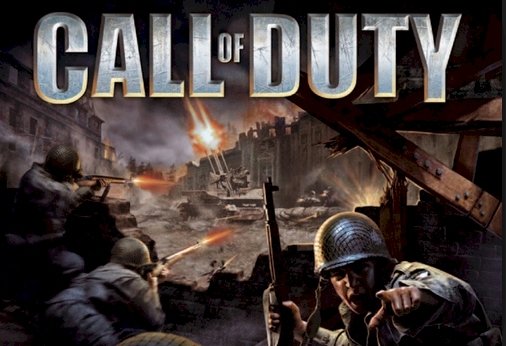
Design Elements of the Call of Duty Logo

The Call of Duty logo is a typographic logo, consisting only of text in a bold font. Where the franchise has changed the logo up the most from game to game has to do with the color of this text.
The most common text color for the Call of Duty logo is a stainless steel grey. This design fits with the militaristic themes of the game, conveying messages of strength and military machinery. Many times, the Call of Duty logo will feature scratches or bullet holes in the text, giving it the impression that it has been worn down by battle. Since Call of Duty is targeting gamers who are looking for a video game that has a lot of action, showing them a logo that looks like it has seen a lot of action itself is a natural choice.
As for the font of the Call of Duty logo, the bold typescript is eye-catching and commanding. By making the “of” in “Call of Duty” much smaller than the rest of the text, the Call of Duty logo is able to look much bigger and more imposing than it actually is. This is a common design used in typographic logos that want to achieve a sense of grandeur, and the Call of Duty logo makes use of it perfectly.
The popularity of the Call of Duty Logo

There’s always a lot of buzz surrounding the new iterations of the Call of Duty logo that go along with each new game, as the new logo is often the first piece of evidence of a new Call of Duty game that is released. In this way, the franchise is able to use its logo and the new versions of it that they design for each new game to generate excitement about the game’s release.
Of course, even after more details about a new Call of Duty game have been made public, the franchise continues to use the logo that goes along with it heavily in their marketing efforts. The graphics they design to advertise the game online almost always feature the logo in some form or another, and the television ads that they produce always feature the logo as well.
In addition to using the Call of Duty to generate buzz about new Call of Duty games, the franchise has also developed plenty of apparel, posters, and other merchandise that is centered around their recognizable logo. This merchandise not only serves as another source of income for the franchise, but it also helps to advertise Call of Duty and build a culture around the series.
The ultimate goal of the Call of Duty franchise is to virtually monopolize the first-person shooter videogame industry. To do this, though, Call of Duty must develop an extremely high degree of brand awareness and brand loyalty, and their recognizable logo has played an enormously important role in helping them achieve this task.


